Dataset and descriptive statistics
The OECD dataset contains information on donor commitments for ten years spanning 2009-2018 (inclusive). This allows us to understand how donor behaviour changes over time.
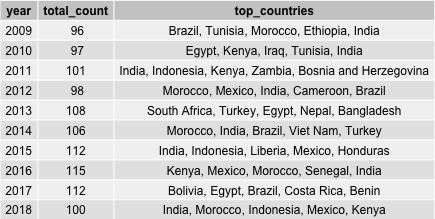
Table 1 shows that on average, the number of donors has increased slightly over the years from 21 in 2009 to 30 in 2018. Total amount of aid for renewable energy has increased from USD \$1.1bn in 2009 to USD \$3.5bn in 2018. Germany, Japan and France are consistently among the top five donor countries in the past ten years by total amount of aid committed. In fact, the top five donor countries represent about 87%-94% of total aid over the decade. The average aid committed is around USD $10m while the median is around USD \$1m, showing a huge skew on some of the bigger aid commitments.
These aid flow into recipient countries to support local efforts for renewable energy projects. Table 2 shows that aid is distributed to around 96-115 countries over the decade. Unlike the donor countries which are rather stable, the top five recipients change considerably from year to year.
Network analysis
One of the hypotheses of this paper is that aid flows can be politically motivated. Network analysis of aid flows can be used to quantify the proportionate size of impact a donor can have on recipients in the aid flow network.
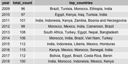
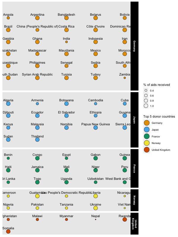
We represent each country (donor or recipient) as a node in the network. The aid flow from the donor to recipient represent edges in the network, creating links from one node to the other. To illustrate this, we take the top 5 donors in 2018 and their aid flows to form the aid flow network shown in Figure 1.
We can see from the aid flow network that there are some recipients who are solely dependent on one donor whereas others are dependent on several donors. The colours of the network show the principal donor for each recipient – i.e. the donor providing the highest share of aid for that recipient.
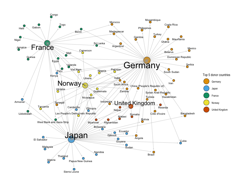
One way of measuring the power dynamics between donor and recipients is through the share of donation a donor country provides to the recipient. Visually, if we isolate the top recipients of aid in 2018, we could see that each of these recipients receives aid from a diverse set of donors.
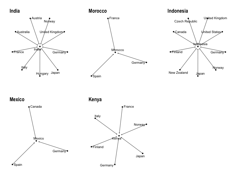
Figure 2 shows that, for example, Morocco receives aid from France, Spain and Germany. To proxy the power relationship between the donors to the recipient, we calculate which donor country provides the highest share of aid to Morocco.
More formally, for each triadic donor-recipient-year pair, we calculate the weighted share in-degree centrality in the network, given by the formula below. $$c_{ijt} = \frac{a_{ijt}}{(\sum\limits_{i}^n a_{ijt})}$$
The centrality measure $c_{ijt}$ , for a given donor ($i$) providing aid to a recipient ($j$) in year ($t$), is the share of aid ($a$) given by that specific donor to the recipient in the year over the sum of all aids given to the recipient in the year by $n$ donors. Using this approach, we can quantify and identify which recipient countries receives significant aid from donor countries.
To illustrate this result, Figure 3 shows a summary of recipient countries grouped by their top donor country. We see that Germany is the top donor to the greatest number of countries. This is a useful proxy of Germany’s power in the recipients network because, should Germany decide to remove their aid, it would cause a significant impact on the recipient’s budget in renewable energy.
Using this metric in our panel regression, we hope to test the hypothesis whether donor countries would provide higher aid if they are in a position of power in a recipient’s aid network.